Manco beer packaging
branding – packaging – print
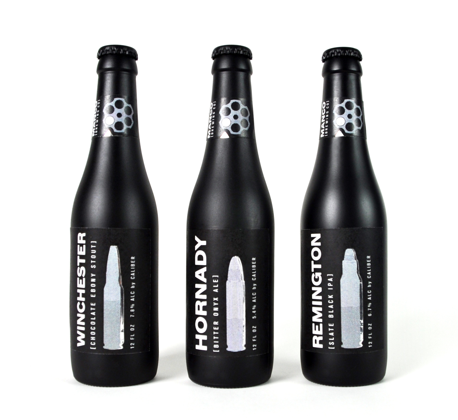
A “bullet series” beer packaging system, inspired by the movie For A Few Dollars More (1965) starring Clint Eastwood. In this movie Eastwood was named Manco, which inspired the brewing company name. In this movie there were many guns, bullets, and ammo which inspired the flavors of beers, and the caliber of the bullet also represents the alcohol percentage.
As a designer, creating a strong concept about an idea is one of my favorite things about design. To me it is what ties the design together and makes it work.
Creating the Manco Company and the beer that it stood for was a fun project to take on. With only three days to create a company name and design bottles to represent it, I referred back to watching old westerns with my dad as I grew up. Alongside having knowledge about guns and ammunition from family members in the military, this all really inspired the idea. If you look closely, the details and language used mimics guns and bullets. For example, the foil detailing brings a shine to the matte black bottles, creating an interesting metal look. The alcohol percentage is measured by caliber instead of volume, the logo itself is a revolver chamber, and the names of each flavor differ between the brands of bullets.


